
Investing in our Design System yielded substantial cost reductions for our clients.
Situation
For years, our organization has lacked a standardized Design System, leading to inconsistent design approaches among clients and redundant frontend development efforts.
Client: Internal Project
Role: UX Lead Designer
Team: Anastasiia Bondarenko, Andre Morelli, Daryna Midved, Derek Ryan, Igor Rudiak, Iryna Hromiak
Deliverables: Design System in Figma with Design Tokens
Task
Create a robust design system utilizing Figma's latest features to empower our designers, frontend developers, and the sales teams. By establishing a comprehensive design token system, we will accelerate workflows, cut costs, and ensure visual consistency across all future projects.
Objectives
1. Create a design system that takes advantage of all Figma’s latest features to create a more efficient work flow for our designers.
2. Establish a design token system to help organize foundational styles better with the goal making hand off easier for developers so that it take less guess work so that they can work faster.
3. Create a design system for our sales to team to offer as product for potential new clients. It must demonstrate flexibility being able to easily adapt to any existing brand styles of an organization while also utilizing well established UX patterns for e-commerce.
4. Put a special emphasis on ease of use by supporting documentation for multiple types of users within the design system.

All great products start with a roadmap.
I initially started off things in Miro with a Road Map session meeting this gave us a better idea of what the expected timeline would look like and what each phase of the project would consist of.


Discovery Work

To kick off our discovery phase we decided to do some stakeholder interviews to get an understanding of the needs of our users.
This included.designers outside the team, frontend developers, and our sales team. Competitive benchmarking was also conducted.


STYLE FOUNDATIONS
The fundamental building blocks of our design system, providing a consistent visual language across all digital products.
Good typography considers accessibility principles such as contrast, legibility, and readability.
Since this is intended to be used for clients that have already defined brand standards we offer a guide within the documentation to quickly change it to support your existing styles.
.
Typography

Our design system ensures consistency and accessibility in light and dark modes by using contrasting text colors: dark text on light backgrounds and light text on dark backgrounds. Accent and semantic colors are used sparingly and adjusted for visibility.
All combinations meet WCAG contrast standards, and interactive elements follow specific color progression guidelines for a cohesive user experience in both themes.

Colors
This system offers a large selection of icons organized by category to support any future needs that may come up.
It also offers style variants to give you personalization and usage guides to guarantee successful.

Iconography
Grids & Spacing

The 12–8–4 column system is commonly used in responsive web design to ensure that the layout adapts well to different screen sizes.
We opt for a 4px 'soft grid' approach, which allows for more nuanced spacing options, while still aligning to an 8px grid. This means every spacing element is divisible by 4 across components and layouts.
.
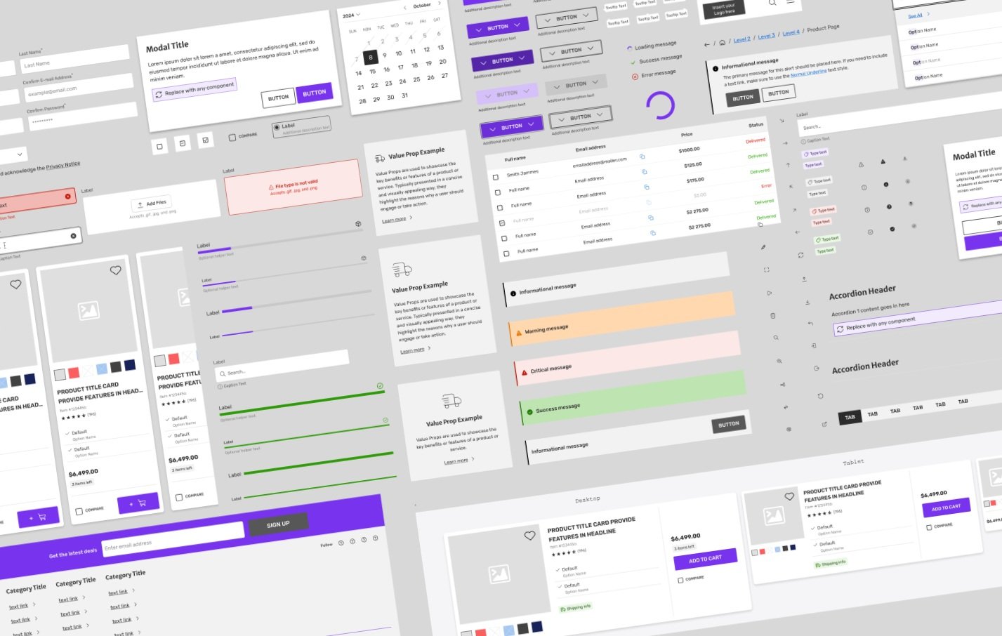
Components
Our components leverage Figma's advanced features such as auto layout, variants, and variables.
To ensure optimal user experience, we reference industry-leading sources like the Baymard Institute and NN/group, integrating proven and effective UX patterns.

Built-In documentation for designers and developers featured on the left side and all component variants with light/dark mode support included on the right.
VARIABLES
Design tokens are a set of foundational design decisions represented as reusable style properties. Within Figma we manage these properties within the variables system.
Variables System Map
This is the visual structure of our we manage our variables system. It not only visually shows which tiers and sections need to be created, but also serves as a navigator in the Design system for easier search of the necessary information.

Primitives & Semantics
Primitives are the fundamental units of design, holding essential attributes such as colors, typography, and spacing.
The next level of this is a Semantic Token, also known as an alias token, is an abstraction layer that reflects the usage of a value in the UI instead of the literal value

Theming
Leveraging our established design primitives & semantics, this theme inherently adapts to both light/dark modes automatically while maintaining correct WCAG color contrast setting a foundation for future themes to benefit from this flexibility.

Establishing a System of Governance
Design systems are continually evolving, towards the end of the project we defined specific roles based on the strengths of our designers to establish a how a future team could manage this design system.
To maintain quality and consistency, we've created comprehensive documentation to guide future contributors.

The Contribution Companion is a concise guide that directs you to the necessary resources to understand the component approval and publishing process.
Results
Managing this project posed a unique challenge due to the diverse range of stakeholders involved we needed to cater to.
Despite the challenges, we successfully launched a comprehensive design system with over 50+ components and design token support, significantly accelerating workflows for both designers and front-end developers.
This effort reduced project kickoff timelines by 25%, which generated measurable cost savings for our clients.

